
Elements
Indicators
USAGE
Definition
Indicators are labels which convey small amounts of information such as a status, in a variety of visual forms, and can use color to communicate meaning.
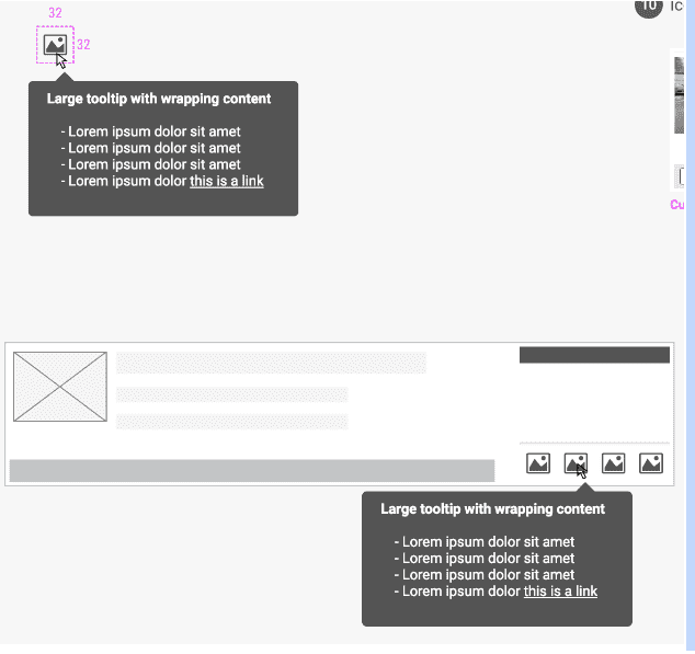
Indicators have either one or two states, and may have an optional tool tip. They are not used to navigate to additional content.
Common Characteristics
All indicators have ALL-CAPS labels, or an icon.
All indicators are single-state (show/hide), or two-state (on/off).
Single-State Indicators
Single-state indicators are displayed in the UI when relevant, and hidden when not.
Flags
Ribbons are best used for words, not acronyms, and do not have tooltips.
Ribbons can be displayed horizontally with content, or diagonally over content. Any single item may have up to two horizontal ribbons, and/or one diagonal ribbon.
Caption: Flags can be used horizontally or diagonally.
Icon Badges
Two-State Indicators
Two-state indicators have color when relevant, and gray when not.
Auction Lights
Caption: Auctions lights have tooltips in both on and off states.
Task Indicators
Task indicators indicate whether a task is complete or incomplete.
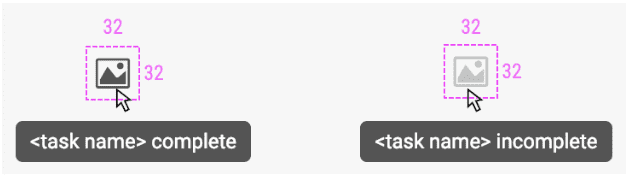
Caption: Task indicators have tooltips in both states.