Elements
Buttons
Definition
Buttons allow a user to submit or request information, make decisions, and for navigation.
Button hierarchy is established by whether a button is contained (i.e. with a background color) for most emphasis, or outlined (no background) for less emphasis, or text only for the least emphasis.
Buttons may be normal (40px high) or small (32px). Full-screen width buttons are only allowed on the XS grid (0-479). In all other cases, button width is determined by the length of the label plus minimum L/R padding.
Common Characteristics
All buttons have bold, ALL-CAPS labels.
All buttons have these states: disabled, active, hover/tap, and focused.
Size
Buttons are normally 40px high, but a small 32px alternative may be used when vertical space is at a premium. Whichever size is used, use the same size for any associated elements like inputs and selects.
Special controls like the keyword search button, pagination controls, icon buttons, and menu buttons are always 32px high.
Hierarchy
Contained Buttons
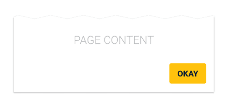
Contained buttons have the most emphasis and should be used for primary actions. When one button is needed (such as an “OK”) use a contained button.
An element cannot have more than one contained button.
Outlined Buttons
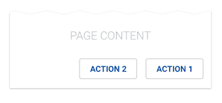
Outlined buttons provide less emphasis. When two or more buttons without hierarchy are needed, use multiple outlined buttons, or multiple text buttons.
Text Buttons
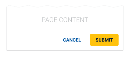
Text buttons have the least emphasis. When two buttons with hierarchy are needed (e.g. “SUBMIT” OR “CANCEL”), use a contained button for the primary action, and a text button for the secondary action.
When two or more buttons without hierarchy are needed, use multiple text buttons, or multiple outlined buttons.
Scenarios
Single Button
When a single button is needed, use a contained button.
Two Buttons with Hierarchy
Two Buttons without Hierarchy
When two or more buttons without hierarchy are needed, they may be outlined buttons or text buttons, but cannot be contained buttons.
Anchored Buttons
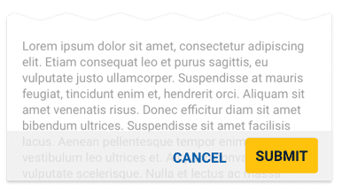
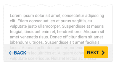
Buttons can be optionally anchored to the bottom of the screen on a semi-transparent action bar.
The text button can be optionally floated to the left.
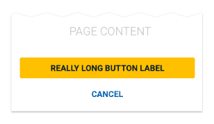
When stacking buttons, the higher priority button (if any) goes on top.
Menu Bars
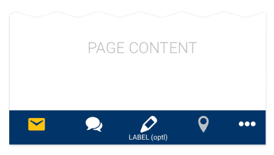
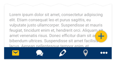
Text Icon buttons may be modified to create a mobile menu bar. Small text labels are optional if needed.
Floating Action Buttons
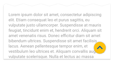
A contained button may be modified to create a floating action button. The floating action button can overlay content and is locked to a specific position in the lower right of the screen.
A floating action button can be used to scroll the user to the top of a screen. In this case, the button is hidden until the user has scrolled down 2x the height of the window.
